Case study · Connected home
TELUS SmartHome+
Security, energy, Wi-Fi and three more services in a single app
The navigation shipped as recommended, and every new service since has launched inside it
The short version
The app had grown one service at a time, so a household with security, energy and Wi-Fi was using three products that shared a login. We agreed with the CPO up front to put all six services into one architecture and one contextual home screen. The design team I led for nearly three years built it, and every new service now ships into that structure.
The problem
TELUS sells the connected home as a set of services: security, automation, energy, internet, connected hardware and parental controls. SmartHome+ is the one app for all of them, across more than 2,000 device models. It was the firm’s largest account by revenue and headcount.
How do you give people one picture of their home when the product is organized as separate services?
Buying a second service meant learning a second set of screens, and each service had its own owner, roadmap and reason to want the first screen. The answer had to work for customers who are mostly not technical, earn the product VPs’ and the CPO’s agreement, and let telecommunications partners adopt it under their own brand.
Key design decisions
One structure for every service
Every service plugs into one navigation and one model of the home. People don’t think of their home as a list of services, so I organized the app around why they open it: to do something, to learn something or to manage the home. A new service arrives as content inside that structure, never as a tab of its own.
BeforeThe beta’s four tabs
AfterThe five tabs that shipped
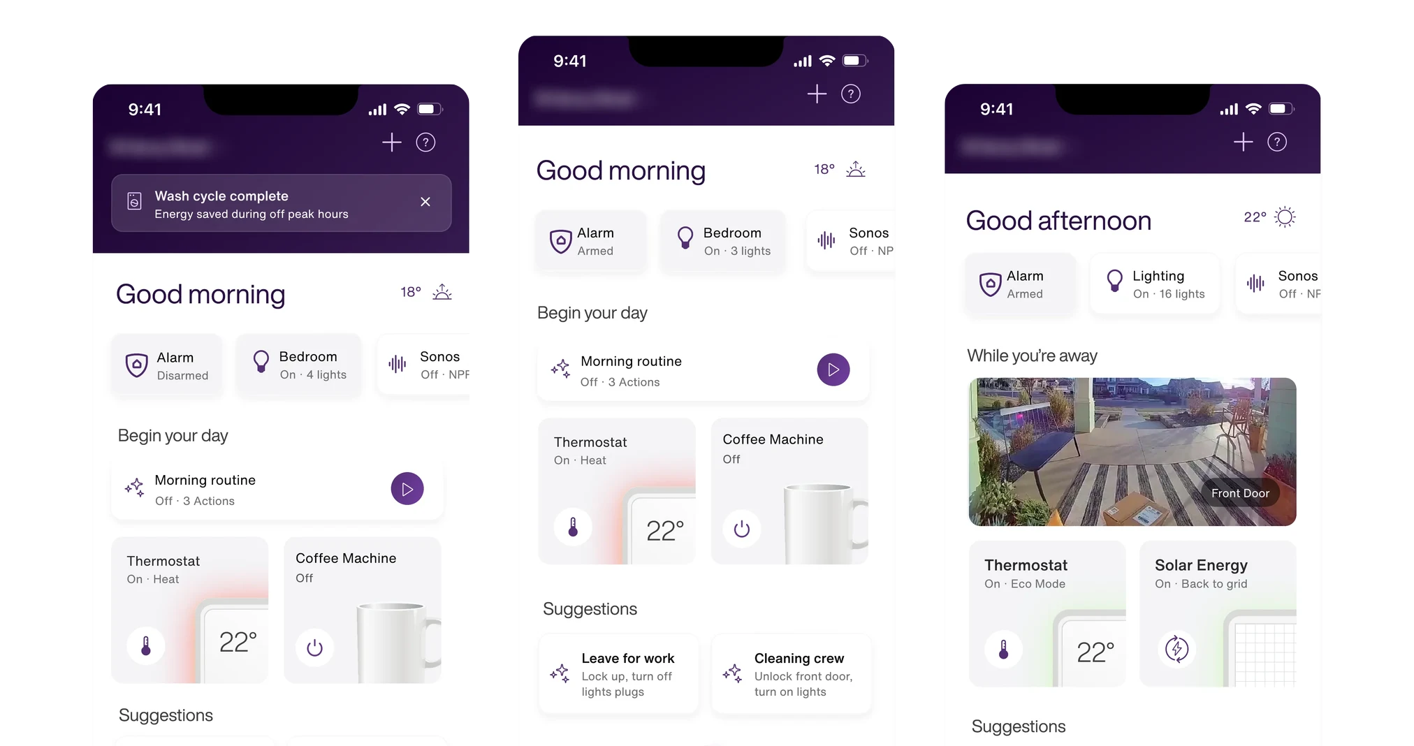
A contextual home that adapts to each household
Every household gets the same five tabs, each filled from the services it pays for, so a home with only internet still gets a complete app. The first screen answers what matters in my home right now: its slots for status, controls, routines and recent activity stay fixed, and what fills them shifts with the services a household has and whether anyone is home.
Three ways to automate
The automation strategy gives people three ways in: describe a routine to the assistant, start from a template, or use the builder. Anything the assistant proposes is previewed before it saves and can be undone in one tap.
Energy in the same app
The SmartEnergy customer journey, which I mapped end to end inside the shared architecture, set the order of the roadmap.
An assistant for the whole home
The north star and customer journey I defined for the AI assistant show how a conversation grows from single requests into a capability across the whole home.
A platform partners can brand as their own
The white-label strategy and UI guidelines let telecommunications partners adopt the platform under their own brand, without one-off design work. The tab names describe what people do, so they fit any carrier’s lineup, and brand colors change while the components stay the same. It hasn’t shipped with a second carrier.
How I worked
We started with what people need from their home. Research, jobs to be done and a service blueprint came before any navigation work, and gave every later workstream one reference: know my home is okay, respond quickly when something happens, automate without losing control, fix problems myself, and improve how my home performs.
We decided on one information architecture for every service. Each service had been designed in its own lane, and the design team was staffed the same way. I designed the shared structure first, and the designers on each workstream designed their service into it. That took months, and it meant each service moving from its own entry point into the shared one.
When the first release was scoped down, we kept the whole model and shipped fewer features inside it. Home and Away launched as a simple manual switch, and I built the working prototype in code so the team could test and demo the flow.
Led
- Design direction for 10–15 designers in North America and Latin America
- Research, jobs to be done and service blueprint
- Contextual home experience
- Stakeholder and executive alignment
- Hiring, onboarding and mentoring
Hands-on
- Information architecture across every service
- North-star strategy and customer journey for the AI assistant
- SmartEnergy customer journey
- White-label strategy and UI guidelines
- Working prototypes in code
Results
7 of 9
tasks at 80% success or better, in a tree test with 92 homeowners
The navigation shipped as recommended in the beta that added the AI assistant, and every new service since has gone into it without a new tab.
TELUS launched the SmartHome+ Assistant in March 2026 and describes it as the world’s first smart home AI assistant with generative UI. I defined its north star and customer journey in 2025. The SmartEnergy journey map went on setting roadmap priorities after I rolled off.
I also led the design team through a major geographic transition. We onboarded four designers, along with partner content and illustration support, without delivery slipping, and attrition and client escalations went to zero.
The navigation, before and after
| Measure | Before | After |
|---|---|---|
| Where a new service goes | A new tab, or More | The same five tabs |
| Catch-all tab | More | None |
From the beta app and the 2024 strategy decks.
Reflection
I still see keeping the model whole through the reduced first release as the most important decision on the account.
Next time I would agree on adoption measures with TELUS at the start, so the team could show what the new structure changed for households as well as in the product.
Our designers each worked inside one service while designing into an architecture that crossed all of them, so I would organize the team around the shared structure from the start.