Case study · Product strategy
SmartHome+ contextual home
A home screen that shows what matters now, in the same order every time
Leadership approved the strategy, and the first release was built on it
The short version
I led the strategy for the SmartHome+ home screen. It has four layers, always in the same order: what needs attention, the devices a household uses most, a section that changes with the household, and suggestions. Leadership approved it, and the first release was built on it.
The problem
SmartHome+ is TELUS’s one app for security, automation, energy, internet and connected hardware, and its home screen is the first thing every customer sees. This is the strategy behind that screen.
How much should a home screen decide for people?
Leadership had said the home screen was too complex. Most customers come to the smart home through their carrier and are new to it, so a screen that rearranges itself is hard to learn. But TELUS knows more about a home than Google, Amazon and the device makers do, like who’s in it and what’s on the network, and the home screen was the place to use that.
Key design decisions
Five requests for the same screen
Service owners and leadership each asked for something different at the top of the home screen. Each request made sense on its own, and nothing said which should come first. That is where the strategy started.
One long scroll, by service
The version in the employee trial ran every section into one long scroll, organized by service, with routines below the first screen.
BeforeThe employee trial
Four rules to choose by
We set four principles so we could judge every request, and every decision after it, the same way.
- 01
Show what matters now
Use what TELUS knows, like who’s home and what’s on the network, to put the right thing first.
Step 03
- 02
Lead with what people want done
People want the house locked up. They don’t want a list of devices to work through.
Step 05
- 03
Stay predictable
The order of the screen stays the same. Only what fills it changes.
- 04
Put the common actions first
People open the app to do one thing. Get them to it in a tap.
Step 04
Four layers, one screen
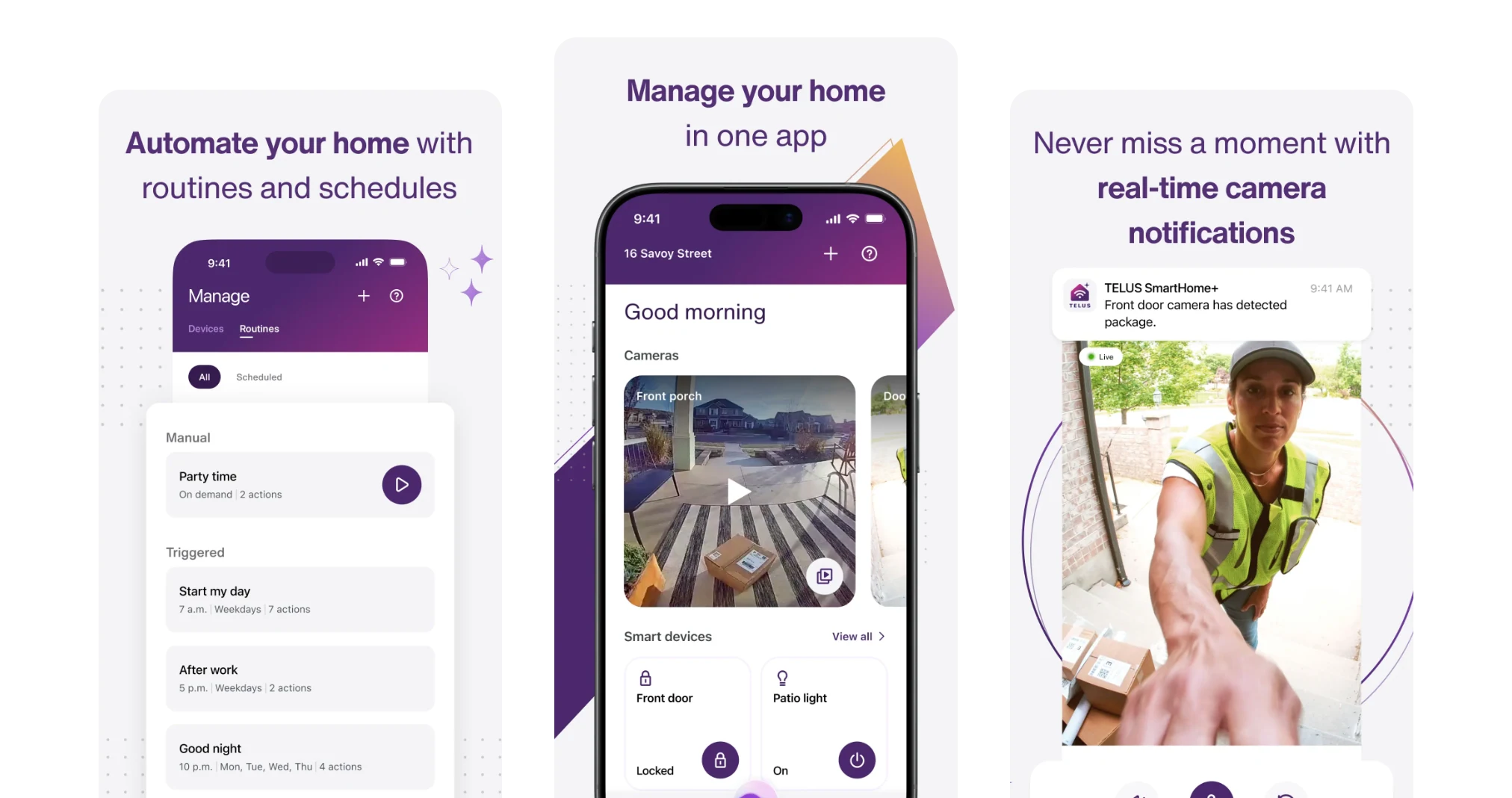
The team’s first version had three layers. Leadership asked for urgent events first and questioned whether pinning was worth building, so I reworked it into four, with presets in place of pins. That’s the version they approved. The same layout changes with the household: a morning routine when you’re home, the front door camera when you’re away.
AfterAt home
AfterAway
One tap instead of four
I made the case with one scenario: a parent with a baby falling asleep in their arms needs to turn off a lamp one-handed. In the old structure that took four taps. From the new home screen it takes one.
What shipped, and what we recommended next
Automatic home-and-away detection wasn’t in scope for the first release, so we shipped two of the layers with a Home/Away switch people set by hand. For the full launch, we recommended the same layers, with the AI assistant at the center of the navigation.
How I worked
Led
- Home screen strategy, principles and foundations
- Alignment with product and engineering leadership
Hands-on
- The four-layer strategy
- The one-tap scenario that made the case for the new structure
- Support designer on Core, the squad that owned the home screen
Results
Leadership approved the strategy, the first release was built on it, and turning off a device from the home screen now takes one tap instead of four.
Before and after
| Measure | Before | After |
|---|---|---|
| Taps to turn off a device | 4 | 1 |
| Adapts to the household | No | Time, place, who’s home |
From the original app and the strategy decks.
Reflection
Next time I would show in the first review which data each layer needs and which release can supply it. Leadership would see how we’d get to the full screen, along with the screen itself.